
A common criticism of cities in the South is their poor walkability and over reliance on the car. Northern cities like New York and D.C. are renowned for their public transit systems which encourage more activity and a relatively healthier lifestyle. For the past two years I’ve been wearing an Apple watch which has coincided with my time living in three different cities: Charlotte, DC, and Charleston, and I was curious if the activity data would reflect these differences.
Changes Over Time
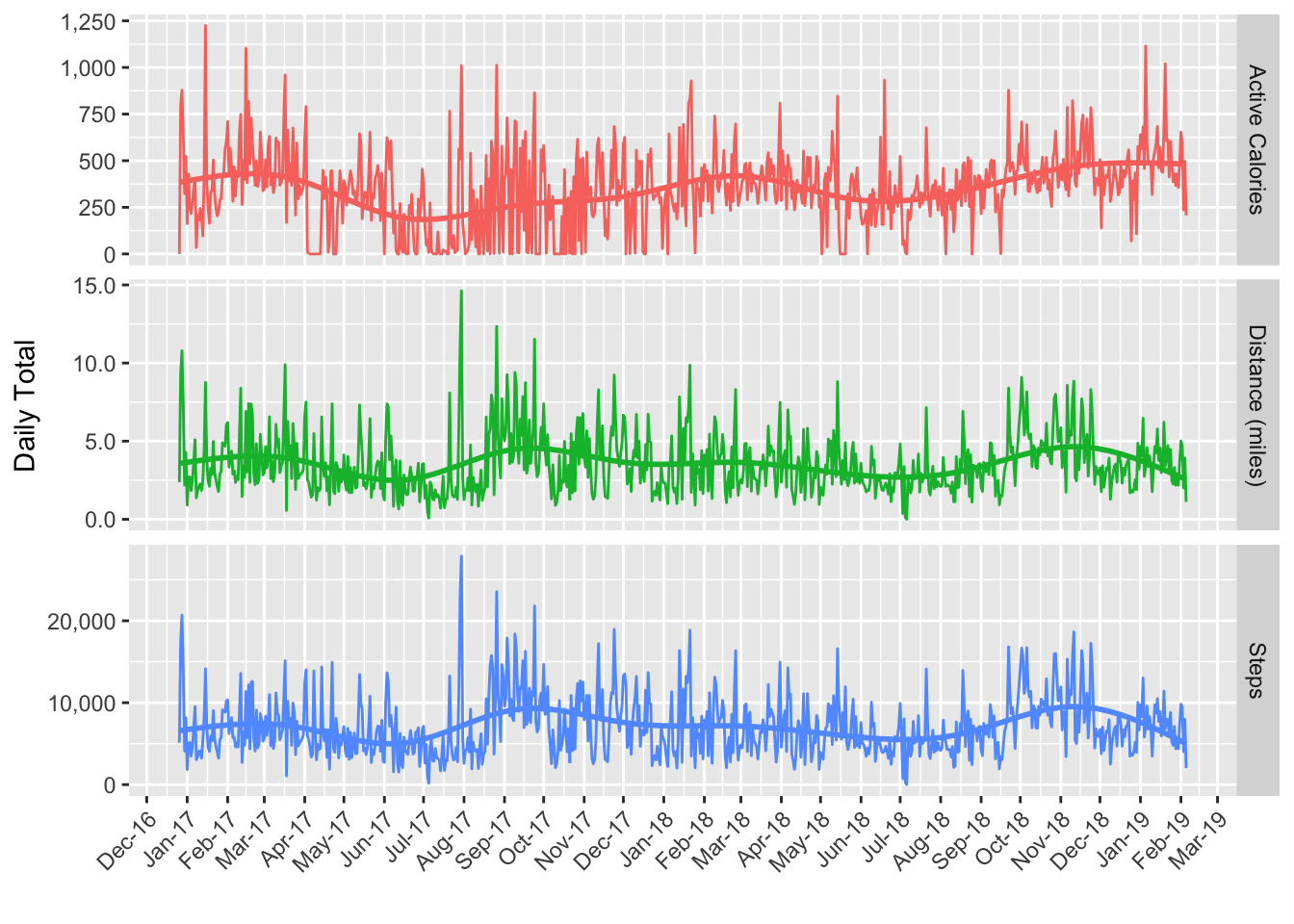
First I’m just curious to see how the metrics have changed over time. There are some pretty clear patterns in the trends, but it’s not obvious yet how they correspond with the different cities. One thing of note is that distance and steps seem to mirror each other pretty closely, but active calories looks like it has a different pattern.
Compare Metrics
To dive into the difference between active calories and distance/steps a little further I’ll standardize them to allow for a direct comparison since currently they all have different units. This means that the actual values themselves won’t be very useful but the patterns will be comparable. I’m also grouping by week now because the standardized daily values are very noisy.
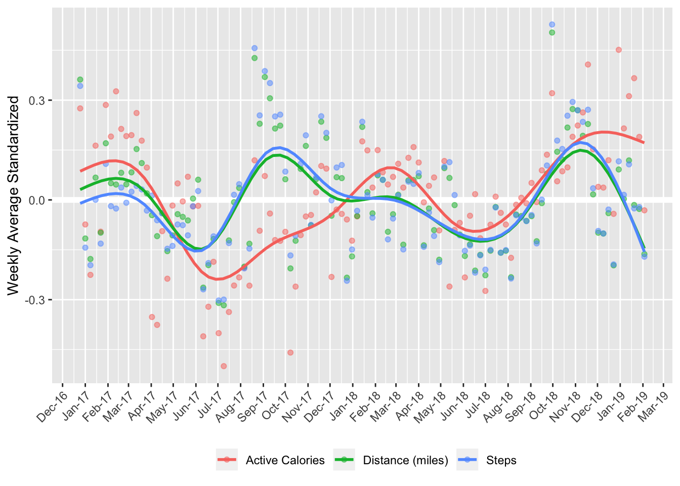
The plot above gives some insight into the differences. Distance and steps clearly mirror each other, and calories have a distinct pattern. The difference it seems is due to periods of high intensity exercise. For example calories exceed the others until May 2017 because I was playing soccer pretty regularly. Then calories are lower Aug to Dec becuase I was mostly just walking around DC. And lastly in Jan 2018 the annual New Years resolution to get in shape came around and active calories rose back up.
Mileage
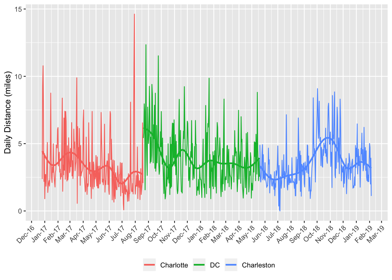
Since calories seem to be more affected by my exercise habits I’ll focus on daily mileage as a comparison. To clarify I’ll color the data based on the time periods I lived in each city. Now some patterns are visible however the differences between cities isn’t as clear as I was expecting. There are large swings in mileage representing the initial excitement and exploration after the move to DC, and some motivated months of running mixed into Charlotte and Charleston.
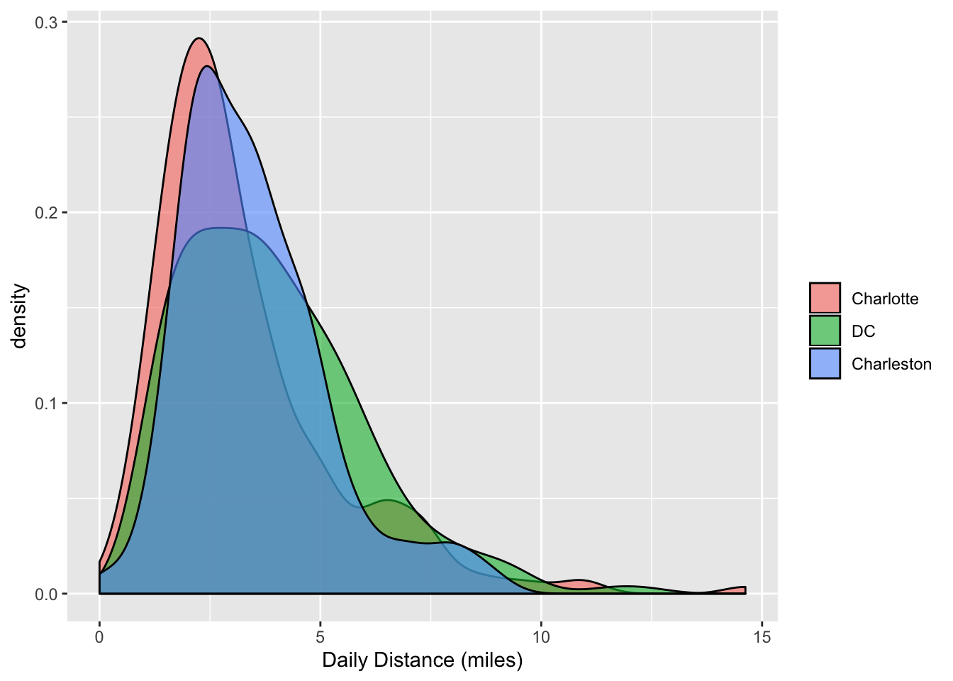
In fact the density plot below shows very little separation between the cities.
One check I can do is simply compare the median mileage per city. Now we can see that DC in fact does have the highest value followed closely by Charleston and then Charlotte.
| City | Median Daily Distance (miles) |
|---|---|
| DC | 3.54 |
| Charleston | 3.29 |
| Charlotte | 2.70 |
Lastly I’ll join Charlotte and Charleston and compare them both against DC with a t test to check the significance between the locations.
##
##  Welch Two Sample t-test
##
## data:  North and South
## t = 3.3019, df = 521.48, p-value = 0.001026
## alternative hypothesis: true difference in means is not equal to 0
## 95 percent confidence interval:
##  0.200140 0.788118
## sample estimates:
## mean of x mean of y
##  3.891972  3.397843
The result shows there is a significant difference between the two groups, and supports the hypothesis that Northern cities encourage a more active lifestyle at least from a walking distance perspective.
