
This is the first project I worked on as a part of the Level data analytics bootcamp. The class was tasked with using baseball game, player, and play data to create creative new sabermetrics. Having grown up exclusively as a soccer player and fan, I had no baseball knowledge to work with. After a late night with wikipedia, I eventually figured out enough to come up with the approach below.
Problem Statement
The problem is to define new metrics specific to each position in baseball. Then I use those to compare each team’s metric rankings against their actual 2016 ranking.
Data
The data is from Stattleship and downloaded via their API. I am limiting it to the 2016 MLB regular season data.
Methodology
14 unique positions are defined in the data and there are a few statistics available for each position. I will combine relevant stats for each position into a single position metric. The following graphs are an overview of some of the stats considered.
Errors per game for both infielders and outfielders
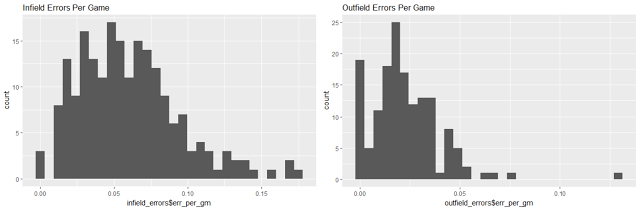
The distribution for infielders has both a higher mean and higher variance than for outfielders so it makes sense to consider the two positions separately.
OPS (On-base plus slugging) for all positions
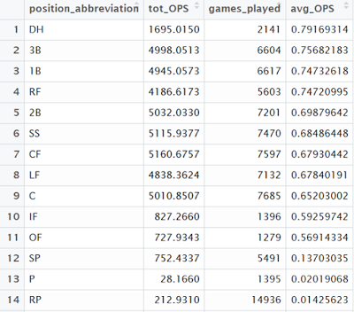
Designated hitters have the highest average OPS, followed by third basemen and first basemen. The three pitcher positions bring up the rear which isn’t surprising.
Multiple pitching stats are combined into single stat K+
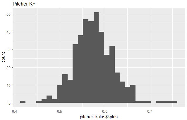
There are several relevant stats for pitchers including strikeouts, ground outs, and fly outs. These are all combined with subjective weighting based on what I’ve learned about baseball to form a single pitcher stat, “K+”.
Standardization
After creating the metrics for each position, I standardized them and then visualized a few of the relationships.
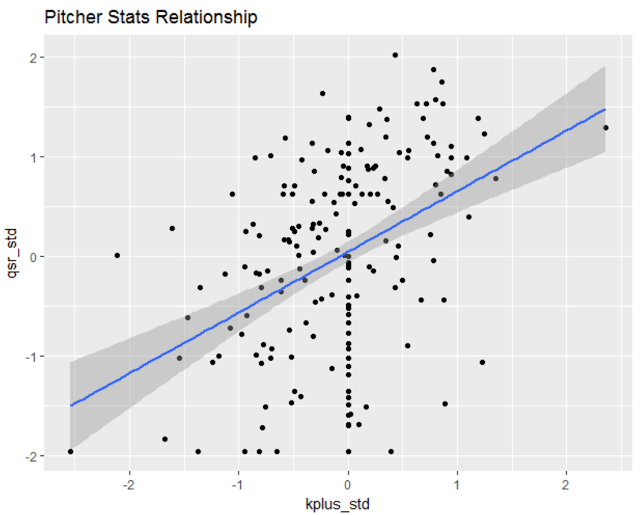
There is a positive (but weak) relationship between the two pitching metrics: K+ and quality start rate.
Results
Finally the metrics are calculated for each player based on the 2016 season data. Teams are then built by selecting the highest scoring players per position that were on their roster in 2016.
Distribution of Teams
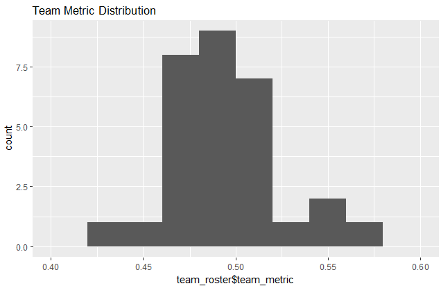
Most teams are clustered around the average with the Chicago Cubs at the top at 0.564 and the Milwaukee Brewers at the bottom with 0.435.
Ranking Comparison
The final team comparison is shown below. The teams are listed in order of their 2016 win/loss record, while the color represents whether they over-performed (green) or under-performed (red) according to the calculated team metric.
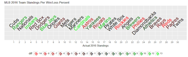
The metric performed reasonably well at the extremes with some surprises, but had more trouble on the teams in the middle of the table. This result makes sense since many teams were close to the average, and a small difference in the metrics could result in a large difference in the expected position.
Obviously there is a lot of room for improvement with these metrics, but this was a great project to practice statistical analysis and visualization skills using the R programming language. If I were to try to improve the metrics I would love do a deeper dive to see what stats are correlated with greater team wins for each position and reweight the metrics based on that knowledge. Also I didn’t get to incorporate the play-by-play data which would be interesting to explore as well.
Code used for this analysis can be found here: GitHub Repo
